Starting a New Project in Figma
My checklist for scaffolding a new mobile or web project

Recently I had a friend shoot me a message:
Hey Tyler, I want to design a mobile app. Where do I start?
Seems open-ended enough, right? 😅 Regardless, I thought it might be useful to write a post on how I start the client work I pick up, specifically in the realm of mobile apps and websites.
My scaffolding of new projects can be summarized in four steps:
- File setup
- Setup basic design tokens
- Setup an initial frame
- Setup a grid
Along the way, I’ll touch upon my exploration process – though most of that may be reserved for a future post. We’ll see.
Anyway, let’s get started.
Setting Up The File
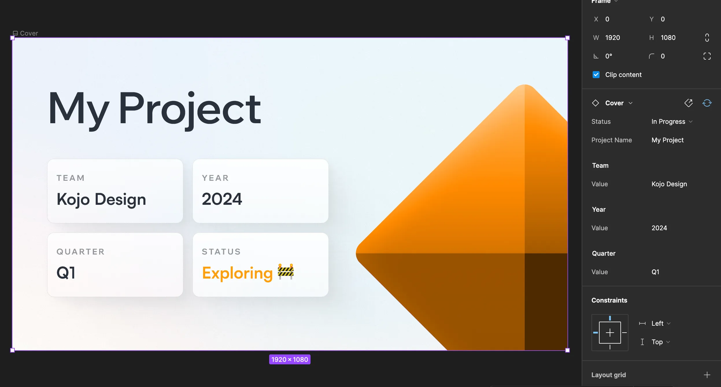
By this point, I already have a template file I simply duplicate to start a new project. The file contains a page structure that looks roughly like this:
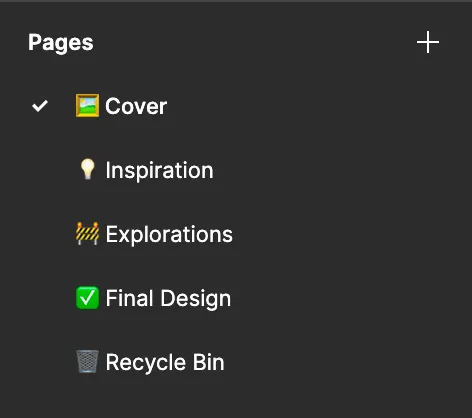
The cover page is a component I created and set as the file’s thumbnail. Covers will typically include the project name, client, year, quarter, and status.
All of the other pages are blank. Their names are hopefully self-explanatory:
- Inspiration: Inspiration gathered from around the web. This might be trends I’ve noticed, styles I particularly like, or just general directions or themes that I like.
- Explorations: Where the majority of the work happens. Design explorations are usually done in high fidelity unless there’s a strong need to explore the UI as a wireframe first. Sometimes, for large projects, I’ll create subpages with ” - ” as a prefix to place below the top-level Explorations page.
- Final Design: Once a design is finalized, it’s moved to this page and seldomly ever touched afterward.
- Recycle Bin: Instead of just deleting scrapped designs, I’ll move them to a dedicated recycling bin so I can track the evolution of the design if I decide to write a case study about the project.
Depending on the needs of the project, I’ll sometimes add additional pages for user goals, components (if there are a lot of them), and brainstorming.
Setting Up Tokens
I love systemized design. While I’m still sometimes guilty of arbitrary colors and duplicate layers, I still try to establish a good baseline before diving into a project.
A recent plugin I discovered which has since become my go-to is Variables Starter by masha. Using the plugin, you can easily generate color, rounding, and spacing variables in Figma. Variables Starter contains several TailwindCSS-inspired palettes for you to choose from if you do wish to choose colors ahead of time.
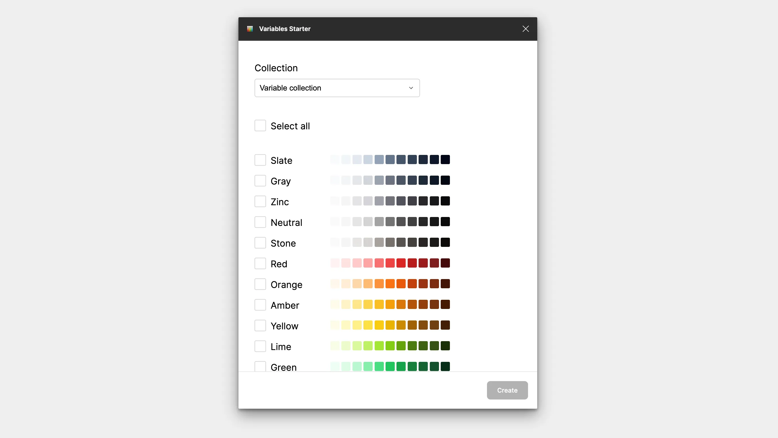
I typically withhold creating variables until I’ve had a chance to experiment with different colors in the design. Other variables, however – such as padding and border-radius – rarely ever change. By generating these variables ahead of time, I can use Tailwind-styled variables (i.e. 4 = 16px) throughout my design so it maps back to code more easily.
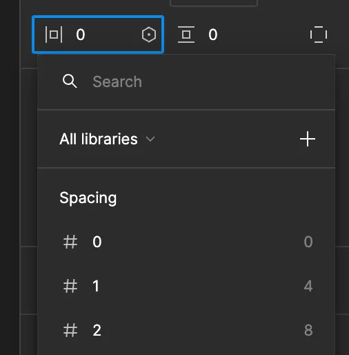
Now when I write Tailwind classes, there’s no mental math. If the padding is
4, the class will be p-4.
Framing It
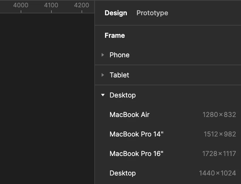
Once I have some base variables in place, I’ll press “F” on my keyboard to select the Frame tool. I’ll then select an appropriate frame size from the right-hand panel.
Next, I’ll add like to add a layout grid to my frame to create the most pixel-perfect design possible. Lately, I’ve been following the advice outlined in DesignByArash’s guide to responsive grids. To save you some time, I’ll summarize below.
Creating a Responsive Grid
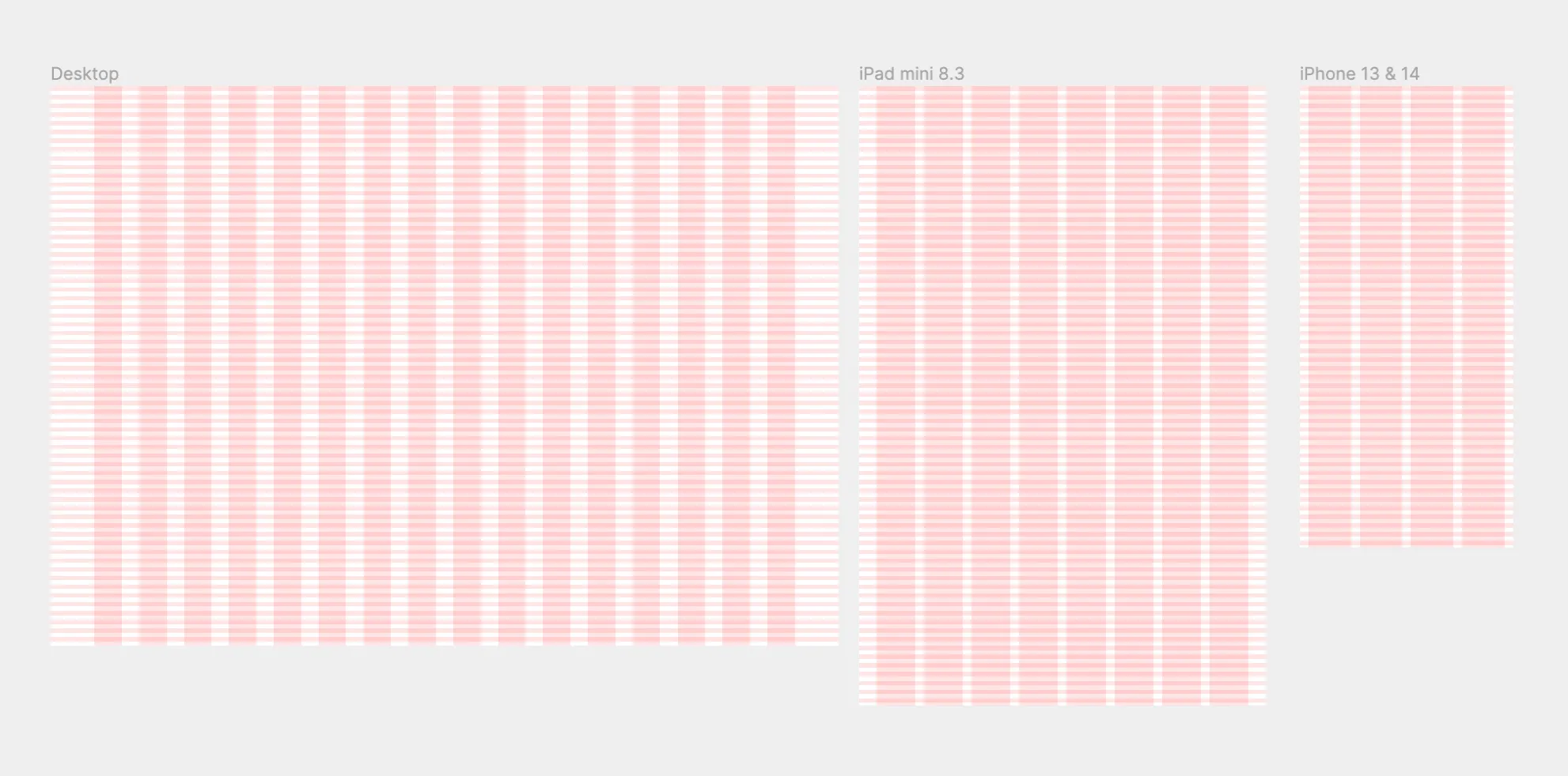
I select my new frame and head over to the “Layout grid” section in the right panel. I create two guides: a column guide and a row guide. While the column guide may change depending on the viewport, the row guide will stay the same across all device types.
Rows
I click the ”+” to create a new guide, then change the type to “Rows” via the dropdown. I add a crazy number of rows (>= 1000) so that the rows are always visible no matter how tall my frame is, making sure that the alignment is set to “Top”.
Next, I give them a height of 8 pixels with an 8-pixel “gutter” (the space between rows). This will provide a guide that allows for easily snapping objects vertically in increments of 8.
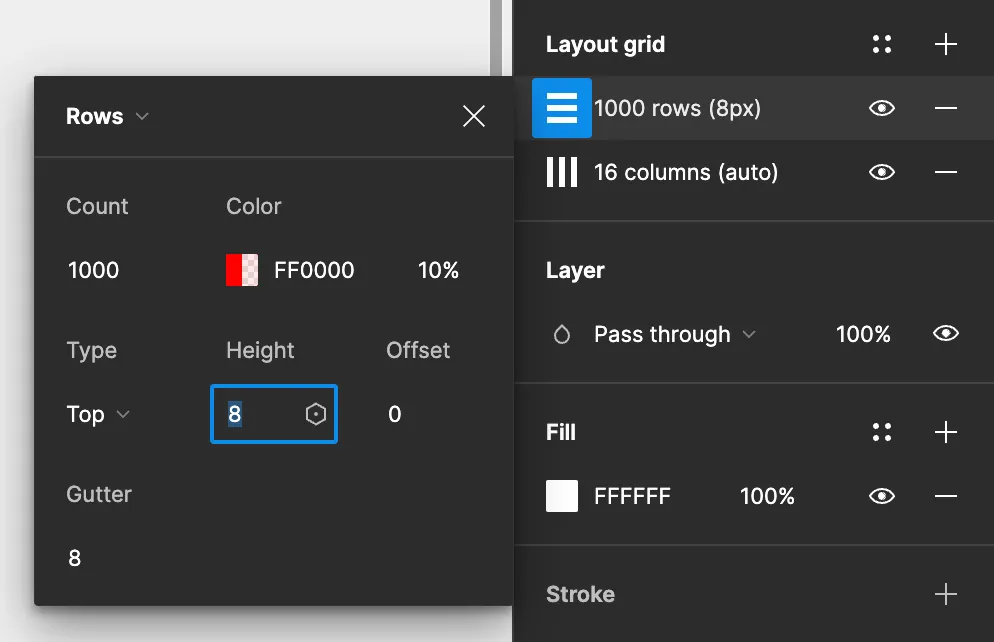
If you’re curious why most designers design in an 8-point system (and why it’s useful), you can read up on it here.
Columns
The number of columns varies depending on the width of the screen I’m working on. However, a common step, no matter the screen, is to first decide what my container width will be. A container is simply the maximum width your content will ever take up on the screen. For a lot of websites, this value can be as low as 800 and as high as 1400 pixels. On smaller screens, containers will typically resort to taking up the full width of the viewport (minus some padding).
In the video I linked, the container widths used are as follows. However, the actual container width may vary depending on the project.
| Screen | Container Width |
|---|---|
| Desktop | 1280px |
| Tablet | 712px |
| Mobile | 374px |
I start by creating a new “Columns” guide with “Type” set to “Stretch”.
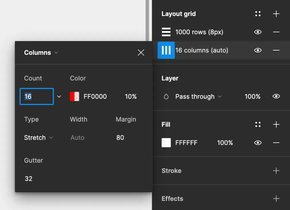
A simple formula I use to get the margin based on my designed container width is:
(frame width - container width) / 2 = margin width
Alternatively, especially on smaller screens, I’ll use my desired left and right padding to dictate the end container width:
horizontal padding x 2 = margin width
Most responsive containers, like the one found in TailwindCSS, default to 100% width on small screens, so it’s important to have padding so your content isn’t flush with the edge of the screen.
Gutter
Next is deciding on the gutter. Like rows, the gutter dictates the space between columns. A good litmus I use to decide the value is to ask myself:
What is the maximum spacing I might use between two adjacent elements?
The answer, at least on a desktop, is usually 32 pixels. Anything bigger feels like too large a gap. On smaller screens, I’ll condense this down to 16 pixels, but never below 16px. That would feel way too cramped.
Column Count
Last is deciding on the actual number of columns. A good rule of thumb is to use multiples of 4 in increasing increments – 4 (1x) on mobile, 8 (2x) on tablets, and 12 (3x) on desktop. Feel free to experiment, though.
This approach always leaves two columns running down the center of the frame that can be used as a guide for centering content.
Updating the Nudge
To make designing a bit easier, I’ll also usually update my nudge amount so that moving elements with my arrow keys snap to the guides I created.
You can achieve this by pressing the command key on your keyboard along with the backslash (”/”) to open the Quick Actions menu. Search for “Nudge amount…” and press Enter.
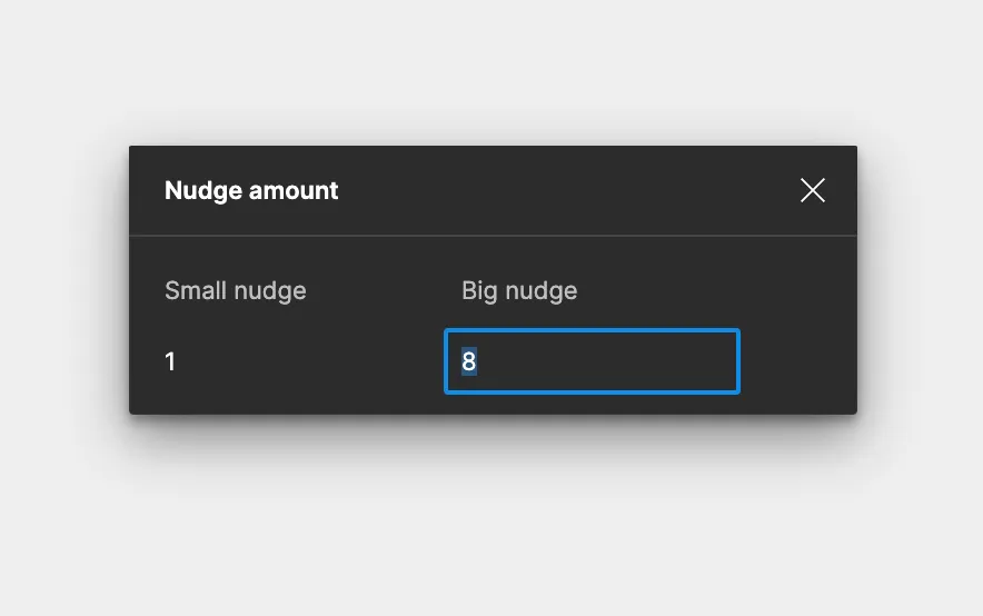
For precision, I’ll set the “Small nudge” to 1 and set my “Big nudge” (achieved by pressing Shift along with an arrow key) to 8.
Wrap Up
After these short steps, I’m ready to roll up my sleeves and dive into my project! My first steps are usually to outline its goals, then hit up sites like Mobbin, Landbook or CallToInspiration to pull inspiration. If I already have a clear idea of where I want the project to head, sometimes I’ll dive right into experimenting.
Hope this guide has been helpful, and see you next time!